10 Best Fonts for Email Signature That Enhance Professionalism
Selecting the appropriate font for email signatures is a critical decision that impacts professional communication. The right typeface enhances clarity
Sophie Grant
Email Signature Specialist, Scribe
On this page
- Introduction
- Scribe: Automate Email Signatures for Consistent Professionalism
- Arial: The Classic Choice for Clear and Professional Signatures
- Helvetica: A Modern Font for Professional Email Signatures
- Georgia: Elegant Readability for Professional Email Signatures
- Verdana: Screen-Friendly Font for Enhanced Readability
- Times New Roman: The Traditional Font for Formal Email Signatures
- Trebuchet MS: A Balanced Font for Professional Appeal
- Tahoma: Clarity and Simplicity for Professional Signatures
- Courier New: Unique Touch for Distinctive Professional Signatures
- Font Size and Pairing: Key Considerations for Professional Email Signatures
- Conclusion
- Frequently Asked Questions
- List of Sources
Introduction
Selecting the appropriate font for email signatures is a critical decision that impacts professional communication. The right typeface enhances clarity, conveys brand identity, and fosters trust with recipients. Let’s delve into the ten best fonts that can elevate professionalism and ensure your messages are received as intended. However, with countless font choices, businesses often struggle to find the right fit for their email signatures. Understanding how to choose the right font can significantly enhance the effectiveness of your email communication.
Scribe: Automate Email Signatures for Consistent Professionalism
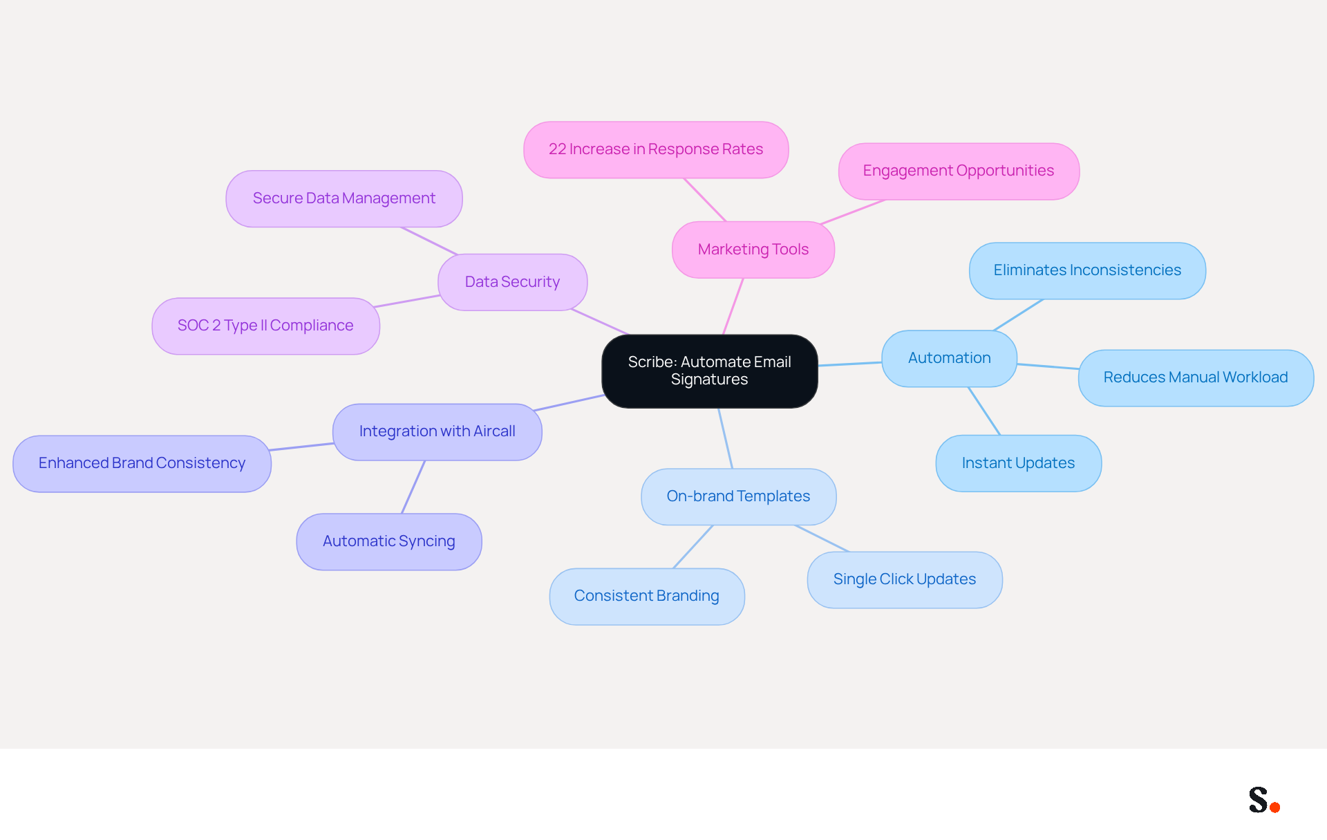
Scribe revolutionizes email management by automating the creation and updates of email identifiers across teams. This automation eliminates inconsistencies often found in manual management. It enhances professionalism in communications.
With Scribe, businesses can implement on-brand template designs and make updates with a single click, significantly reducing the time spent on maintenance. Updates that once took days can now be completed in minutes, allowing teams to redirect their efforts toward strategic initiatives.
Furthermore, Scribe seamlessly integrates with Aircall, automatically syncing account information from your business phone system. Not only does this feature enhance brand consistency, but it also shows Scribe's commitment to keeping your data secure, as it is SOC 2 Type II compliant.
Automated messaging tools act as a potent marketing instrument, incorporating chances for interaction in every message sent. Companies employing consistent branded communication headers report a 22% increase in response rates, demonstrating how this approach drives engagement and builds trust with recipients.
As this form of communication remains a primary channel for professional interaction, with 93% of professionals checking messages daily, by harnessing this often-overlooked branding element, businesses can significantly enhance their professional image and engagement rates.
Arial: The Classic Choice for Clear and Professional Signatures
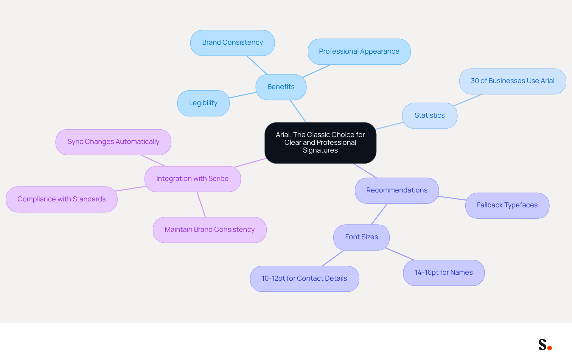
Choosing the best fonts for email signature is crucial for maintaining professionalism in business communications. Arial is one of the best fonts for email signature, known for its clean, modern aesthetic and exceptional legibility. Its widespread adoption across various messaging clients ensures compatibility, which is essential for maintaining a professional appearance. Arial's simplicity helps businesses convey messages clearly and effectively, enhancing professionalism.
Research indicates that Arial is considered one of the best fonts for email signature, with over 30% of businesses opting for it in professional correspondence. The font's straightforward design not only improves readability but also aligns with the branding needs of diverse organizations. Case studies indicate that companies using Arial in their correspondence have reported enhanced clarity and consistency, contributing to a stronger brand image.
Experts in typography recommend Arial for business communications because it ensures messages are easily understood on various devices. By selecting Arial, businesses can improve their correspondence formats, making them not only practical but also a reflection of their dedication to professionalism.
Scribe automatically syncs changes from your Calendly configuration to your email signatures, keeping your branding consistent and up-to-date. This seamless integration enables effortless updates, reinforcing brand consistency across all interactions. Scribe also adheres to SOC 2 Type II compliance and is designed to meet GDPR and CCPA standards, ensuring secure data handling. It is essential to define fallback typefaces in HTML to ensure readability if Arial is unavailable, and to use recommended sizes of 14-16pt for names and 10-12pt for contact details. Testing digital identifiers across different devices and platforms is crucial to uphold a professional appearance in all communications. By prioritizing clarity and consistency in their communications, businesses can significantly enhance their professional image.
Helvetica: A Modern Font for Professional Email Signatures
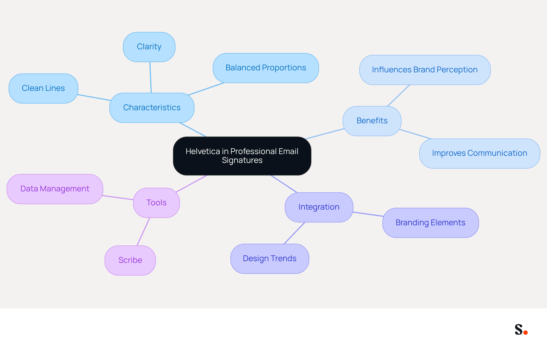
In a competitive business landscape, the choice of typeface can significantly influence brand perception and communication effectiveness. Helvetica is a modern sans-serif typeface celebrated for its professionalism and clarity. Its clean lines and balanced proportions make it an ideal choice for various business contexts, particularly in design-oriented industries. Its clarity ensures excellent performance in digital communications, reinforcing your brand's modern image.
Research indicates that a significant majority of professionals leverage their message formats to strengthen brand image, making Helvetica a valuable choice. By choosing Helvetica, businesses can bolster their professional identity while improving how they communicate.
To maximize the impact of your message footer, consider integrating Helvetica with other branding elements and regularly updating your design to reflect current trends.
With Scribe, you can automate the management of your digital identifiers, ensuring that any changes made in your business phone system, such as Aircall, are effortlessly synchronized. This not only improves brand consistency but also ensures secure data management, thanks to Scribe's SOC 2 Type II compliance, making Helvetica even more effective as part of your professional communication.
Incorporating Helvetica into your communication strategy may transform your brand's digital presence.
Georgia: Elegant Readability for Professional Email Signatures
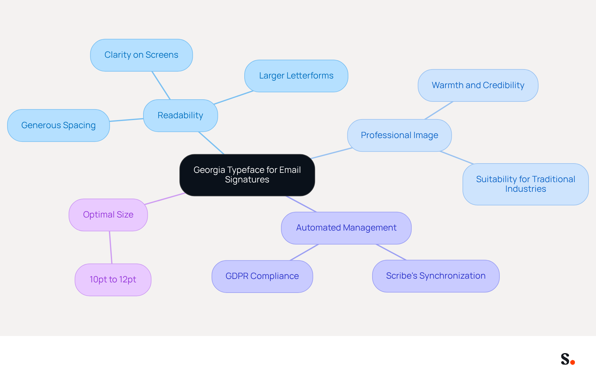
Georgia is a serif typeface that excels in clarity on screens, making it one of the best fonts for email signature. Its larger letterforms and generous spacing significantly enhance readability, which is crucial for professional communication, making it one of the best fonts for email signature. Research shows that Georgia is among the best fonts for email signature, enhancing legibility, especially on digital platforms, which is vital for a polished appearance. This font is among the best fonts for email signature as it conveys warmth and credibility, making it particularly suitable for industries that value tradition and formality. By adopting Georgia, which is considered one of the best fonts for email signature, businesses can project a trustworthy and sophisticated image in their correspondence, thereby strengthening their professional image.
Furthermore, with Scribe's automated management of digital signatures, updates to them can be effortlessly synchronized across the organization, ensuring brand consistency and compliance with GDPR standards. Scribe's SOC 2 Type II certification underscores its dedication to security and compliance, assuring organizations of their data safety.
For optimal readability, it is advised to use Georgia at a size between 10pt and 12pt, ensuring that the mark remains clear and legible across various devices.
Verdana: Screen-Friendly Font for Enhanced Readability
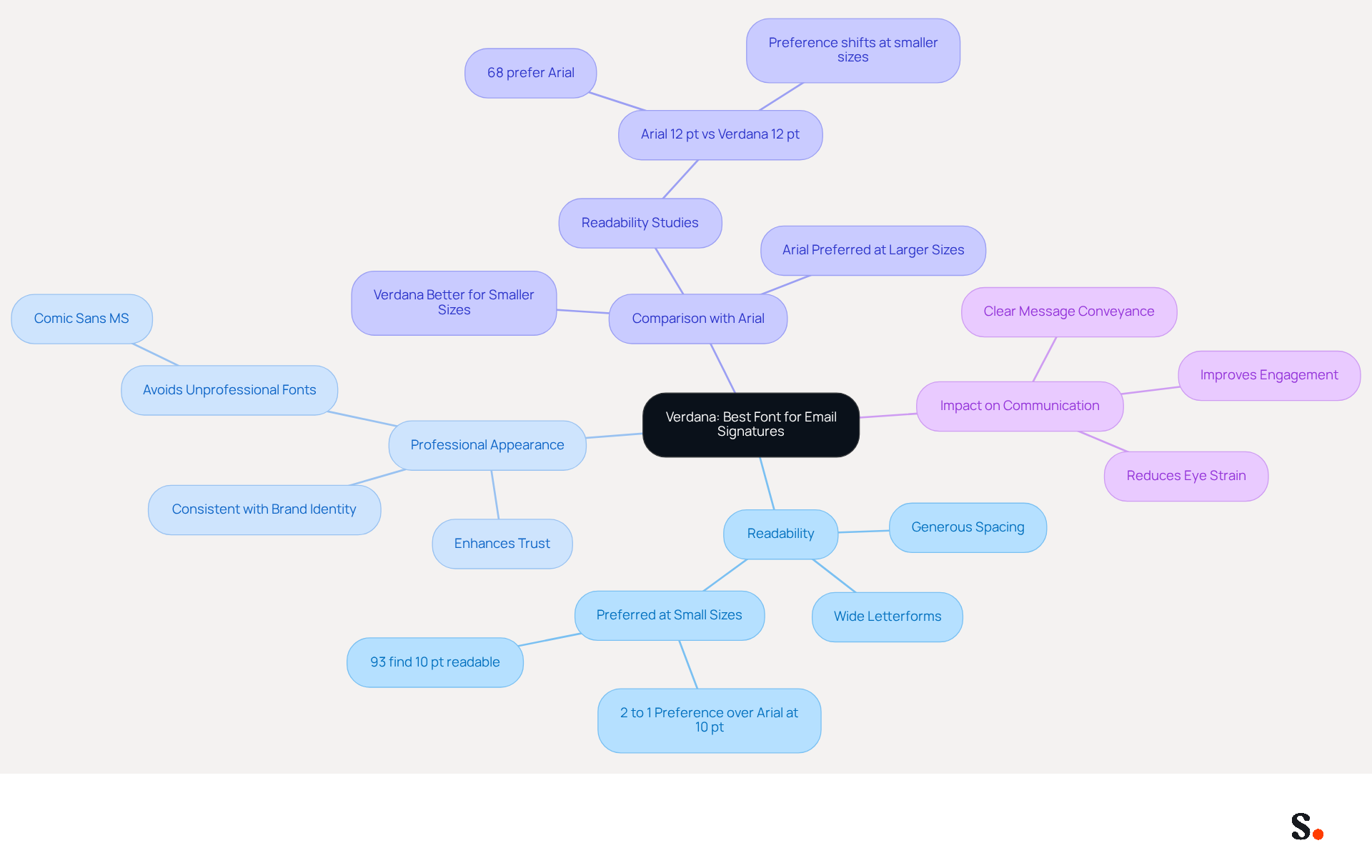
Choosing the best fonts for email signature is crucial for ensuring clarity and professionalism in digital communications. Verdana is a highly regarded sans-serif typeface known for its exceptional screen readability, making it an ideal choice for email footers. Its wide letterforms and generous spacing significantly reduce visual crowding, ensuring that text remains legible even at smaller sizes. This feature is especially helpful for signatures that often include multiple lines of information, like contact details and social media links.
Research shows that Verdana is particularly readable on digital devices, allowing for clear communication without causing eye strain. Studies indicate that readers consistently favor Verdana over Arial for smaller text sizes, particularly at 10 pt and below. By choosing Verdana, which is considered one of the best fonts for email signature, businesses can enhance the professionalism of their email signatures while ensuring that recipients can easily read and engage with the information presented. Ultimately, selecting Verdana can significantly impact how effectively your message is conveyed in a crowded digital space.
Times New Roman: The Traditional Font for Formal Email Signatures
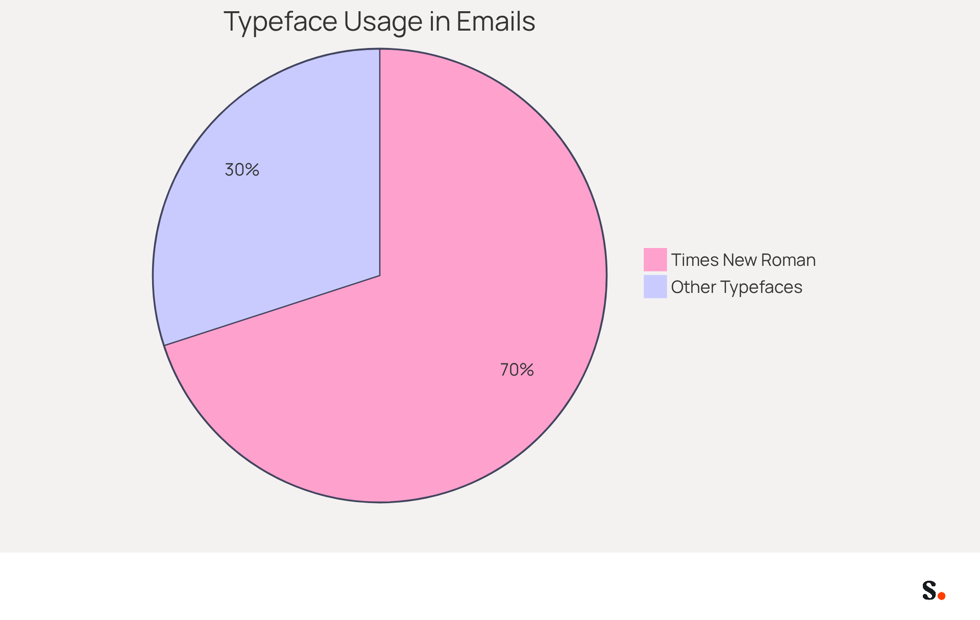
In formal correspondence, the choice of typeface can significantly impact the perception of professionalism. Times New Roman is a serif typeface that has long been associated with formal communication. Its classic design and traditional appearance make it an ideal choice for industries that prioritize professionalism and formality. Although it lacks the modern appeal of some sans-serif fonts, Times New Roman's familiarity fosters trust and reliability. This is especially significant for enterprises in legal, academic, or governmental fields, where conveying a serious and professional tone in correspondence is essential.
Research shows that Times New Roman is the typeface of choice in over 70% of formal communications, reinforcing its status as a preferred typeface for professional settings. Organizations using Times New Roman in their correspondence have experienced improved credibility and engagement, as the typeface's traditional aesthetic aligns with the expectations of their audiences. Moreover, when combined with Scribe's management capabilities, Times New Roman can be utilized effectively while ensuring compliance with GDPR and leveraging Scribe's SAML single sign-on for secure access. Many experts point out that its legibility and solid reputation make it effective for formal communications, making it a preferred choice for those aiming to maintain a polished and professional image.
Trebuchet MS: A Balanced Font for Professional Appeal
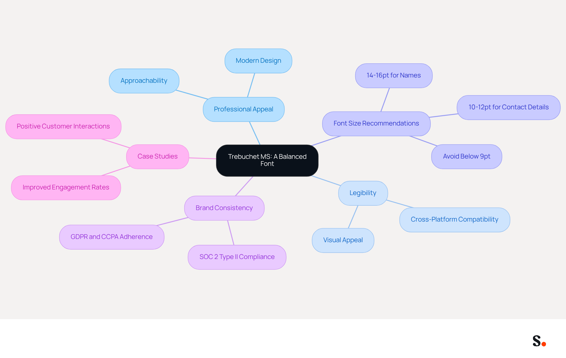
Choosing the best fonts for email signature is crucial for effective digital communication, and Trebuchet MS is a standout option. Trebuchet MS is a sans-serif typeface that effectively balances professionalism and approachability, making it an excellent choice for digital correspondence. Its modern design, characterized by slightly rounded edges, conveys a friendly yet professional image, ideal for businesses aiming to project a contemporary brand identity. Trebuchet MS is one of the best fonts for email signature, as it works well across various platforms, ensuring your email signatures look great regardless of the recipient's email client.
Statistics show that Trebuchet MS is popular in business communications due to its legibility and visual appeal. Experts recommend using a font size of 14-16pt for names and 10-12pt for contact details to enhance readability across devices, particularly on mobile.
Furthermore, with Scribe's automated synchronization of identifiers with Aircall, any modifications made in your Aircall settings will be effortlessly reflected in your Scribe identifiers. Maintaining brand consistency while ensuring compliance with regulations can be challenging for businesses. However, this ensures enhanced brand consistency across all communications while adhering to SOC 2 Type II compliance and data protection regulations like GDPR and CCPA.
Case studies emphasize the effective application of the best fonts for email signature, including Trebuchet MS, in professional communication, showing how it can enhance brand perception through real-world examples. Organizations that adopted this typeface reported improved engagement rates, as the friendly appearance of Trebuchet MS encourages positive interactions with recipients. This positive reception can foster greater customer loyalty and trust. By adopting Trebuchet MS, businesses not only enhance their professional image but also foster stronger connections with their audience.
Tahoma: Clarity and Simplicity for Professional Signatures
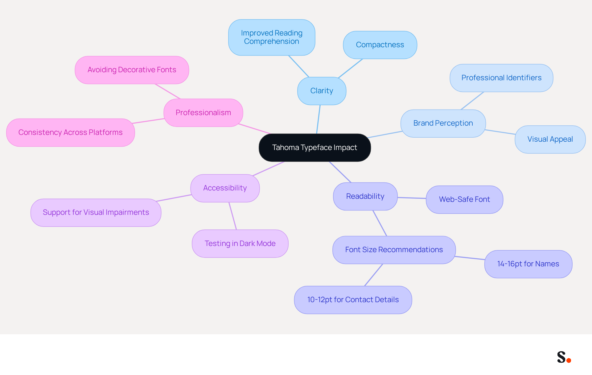
In the realm of professional communication, the choice of typeface can significantly impact clarity and brand perception. Tahoma is a highly regarded sans-serif typeface known for its compactness and clarity, making it one of the best fonts for email signature. Its narrow letterforms allow for more information to be included without sacrificing readability, a key factor in ensuring messages are understood clearly.
Studies show that the right typeface can improve reading comprehension significantly, making Tahoma an effective choice. By adopting Tahoma, businesses can create professional identifiers that are not only functional but also visually appealing, thereby enhancing their overall brand image. Without a web-safe font, businesses risk inconsistent rendering, which can undermine their professional image.
Moreover, Scribe ensures that all modifications made to your Calendly setup automatically sync with your contact details, maintaining brand consistency and effortless updates. Scribe's SOC 2 Type II compliance guarantees secure data management, enhancing trust in your digital interactions.
Studies show that organizations using the best fonts for email signature, like Tahoma, often see improved clarity and professionalism, emphasizing the significance of type selection in effective communication. Furthermore, it is crucial to test digital identifiers in dark mode to prevent readability problems, ensuring that all recipients can access the information effortlessly.
Tahoma's design aligns well with accessibility standards, ensuring that messages reach a broader audience, including individuals with visual impairments. Choosing Tahoma not only enhances readability but also reinforces a brand's commitment to professionalism and accessibility.
Courier New: Unique Touch for Distinctive Professional Signatures
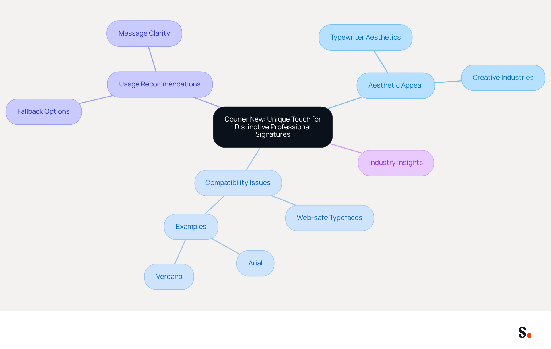
Courier New, a monospaced font reminiscent of typewriter aesthetics, offers a distinctive option for email footers, particularly in creative industries. While not the primary choice for all sectors, its unique aesthetic resonates in creative fields, where nostalgia enhances interaction. The uniform character spacing of Courier New ensures consistent text alignment, making it an excellent option for endorsements that incorporate code snippets or technical details. Utilizing Courier New allows businesses to add a creative flair to their communications while maintaining professionalism. Organizations in creative sectors have effectively used Courier New to create memorable signatures that reinforce their brand identity and engage recipients.
However, while Courier New adds a unique touch, its compatibility may not match that of other email-safe typefaces. Based on industry insights, utilizing web-safe typefaces is essential for ensuring that messages display correctly across various devices and mail clients. For example, typefaces such as Arial and Verdana are frequently suggested for their compatibility and readability.
With Scribe, all modifications made to your Calendly setup automatically sync with your contact details, ensuring brand consistency and effortless updates. Scribe is also SOC 2 Type II compliant and adheres to GDPR and CCPA regulations, providing secure data handling for your organization. As Helga, CMO at Newoldstamp, highlights, 'Professional identifiers generally depend on web-safe typefaces - typefaces that are assured to display accurately across various devices and messaging programs.'
To effectively utilize Courier New in digital communications, consider pairing it with a more widely accepted typeface as a fallback option. This method guarantees that your mark retains its intended look, even if the primary typeface is not available on the recipient's device. Furthermore, keep your message footer brief and centered on crucial details to improve clarity and interaction. Ultimately, ensuring compatibility with a fallback typeface is crucial for maintaining professionalism in digital communications.
Font Size and Pairing: Key Considerations for Professional Email Signatures
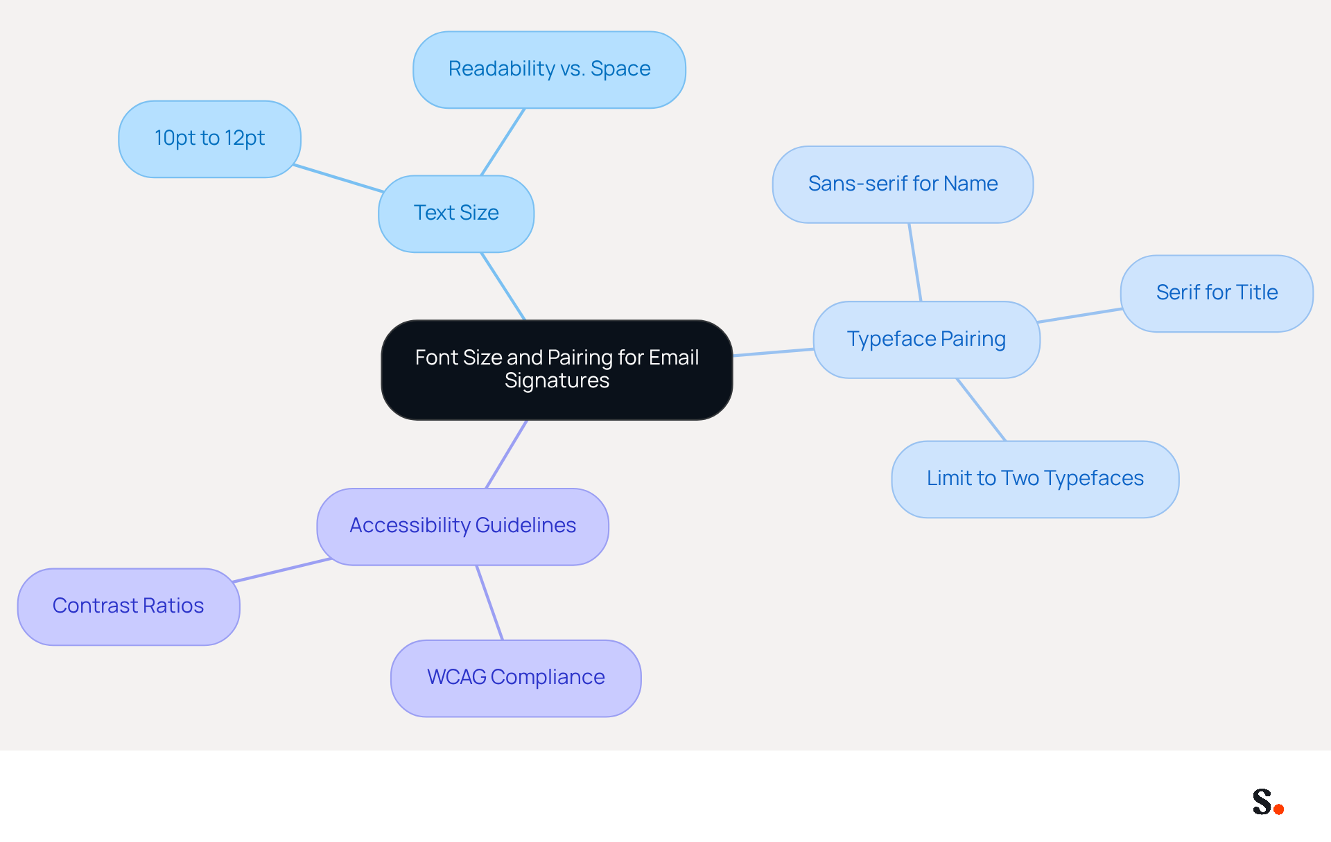
Selecting the appropriate text size and typeface combination is crucial for using the best fonts for email signature to create effective email signatures. The ideal text size for autographs typically ranges from 10pt to 12pt, striking a balance between readability and the constraints of available space. This range aligns with best practices that advocate for a clear structure in sign-offs, ultimately enhancing user experience.
Additionally, combining typefaces can elevate visual appeal; for instance, using a sans-serif type for the name alongside a serif type for the title creates a pleasing contrast that draws attention to key details. Limiting the number of typefaces to two ensures a cohesive and professional appearance.
Furthermore, adhering to WCAG guidelines for contrast ratios is vital to guarantee accessibility for all recipients. By thoughtfully considering font size and pairing, businesses can craft email signatures that utilize the best fonts for email signature to convey professionalism and engage recipients visually.
Conclusion
Many organizations find it challenging to maintain a consistent and professional image in their email communications. Choosing the right font for email signatures is crucial for projecting professionalism and enhancing brand image in digital communications. This article highlights ten fonts that improve readability while aligning with the branding needs of various organizations. Using these fonts helps businesses create email signatures that are clear and professional, building trust and engagement with recipients.
Key insights include the advantages of popular fonts like Arial, Helvetica, and Georgia, each offering unique benefits in terms of legibility and aesthetic appeal. The integration of Scribe's automation capabilities further enhances the effectiveness of these fonts by ensuring consistent branding and compliance with security standards such as SOC 2 Type II, GDPR, and CCPA. This seamless management allows organizations to focus on strategic initiatives rather than the minutiae of email signature updates.
The choice of font plays a crucial role in how messages are perceived in digital communication. By adopting the recommended fonts and leveraging tools like Scribe for email signature automation, businesses can enhance their professional image and improve engagement rates. Adopting these best practices can transform how organizations are perceived in the digital realm.
Frequently Asked Questions
What is Scribe and how does it enhance email management?
Scribe is a tool that automates the creation and updates of email signatures across teams, eliminating inconsistencies found in manual management and enhancing professionalism in communications.
How does Scribe improve the efficiency of email signature updates?
With Scribe, businesses can implement on-brand template designs and make updates with a single click, significantly reducing the time spent on maintenance from days to minutes.
What integration features does Scribe offer?
Scribe seamlessly integrates with Aircall, automatically syncing account information from your business phone system, which enhances brand consistency and ensures secure data handling.
What compliance standards does Scribe adhere to?
Scribe is SOC 2 Type II compliant, ensuring that data is handled securely.
How can automated messaging tools like Scribe impact marketing?
Automated messaging tools can incorporate chances for interaction in every message sent, leading to a reported 22% increase in response rates for companies using consistent branded communication headers.
Why is the choice of font important for email signatures?
The choice of font is crucial for maintaining professionalism in business communications, as it affects readability and brand perception.
What are the benefits of using Arial for email signatures?
Arial is known for its clean, modern aesthetic and exceptional legibility, making it compatible across various messaging clients and enhancing professionalism in communications.
How does Scribe ensure brand consistency with email signatures?
Scribe automatically syncs changes from your Calendly configuration to your email signatures, keeping branding consistent and up-to-date.
What font sizes are recommended for email signatures?
Recommended sizes are 14-16pt for names and 10-12pt for contact details to ensure readability.
What is the significance of using Helvetica in email signatures?
Helvetica is a modern sans-serif typeface known for its professionalism and clarity, making it an ideal choice for various business contexts, particularly in design-oriented industries.
How does Scribe support the use of Helvetica in professional communications?
Scribe automates the management of digital identifiers, ensuring that any changes made in your business phone system are effortlessly synchronized, which improves brand consistency and secure data management.
List of Sources
- Scribe: Automate Email Signatures for Consistent Professionalism
- Automating Email Signatures: How IT Teams Streamline Processes & Reduce Risk (https://exclaimer.com/blog/streamlining-it-processes-automated-email-signatures)
- 40+ Email Signature Statistics for 2026 (Data + Insights) (https://wavecnct.com/blogs/email-signature-statistics)
- Email signature statistics: Why every business should optimize their email signatures — Stripo.email (https://stripo.email/blog/email-signature-statistics-why-every-business-should-optimize-their-email-signatures)
- 2026 Marketing Trends for Business Emails Outreach | Rocketseed (https://rocketseed.com/blog/2024-marketing-trends-for-business-emails)
- 2026 Email Signature Trends: Centralized Control & Automation | SIGNandGO posted on the topic | LinkedIn (https://linkedin.com/posts/signngo_email-signature-trends-to-watch-in-2026-activity-7401523471786217473-zAVL)
- Arial: The Classic Choice for Clear and Professional Signatures
- The Best Fonts for Email Signatures That Look Clean and Professional (https://bulksignature.com/blog/the-best-fonts-for-email-signatures)
- Best Fonts for Email Signatures – secure and legible fonts (https://gsignature.com/blog-post/the-best-fonts-for-email-signatures---secure-professional-and-legible)
- The Best Fonts for Email Signatures: A Professional Guide (https://linkedin.com/pulse/best-fonts-email-signatures-professional-guide-bulksignature-tmvuf)
- Choose the Best Email Signature Font for Brand Consistency (https://scribe-mail.com/en-US/blog/choose-the-best-email-signature-font-for-brand-consistency)
- Helvetica: A Modern Font for Professional Email Signatures
- 7 ways email signatures boost brand image (https://signitic.com/en/resources/7-ways-email-signatures-boost-brand-image)
- 15 Ways Email Signatures Can Boost Your Brand | Rocketseed (https://rocketseed.com/blog/15-ways-email-signature-branding-can-boost-your-brand)
- Research Recap: Branded Email Signatures Increase Company Recognition, Trust - Demand Gen Report (https://demandgenreport.com/industry-news/research-recap-branded-email-signatures-increase-company-recognition-trust/47252)
- Email Signature Branding: Consistency and Impact | Crossware365 (https://crossware365.com/blog/mastering-email-signature-branding-market-presence)
- How to Write an Email Signature That Boosts Your Brand (https://scribe-mail.com/en-US/blog/how-to-write-an-email-signature-that-boosts-your-brand)
- Georgia: Elegant Readability for Professional Email Signatures
- Best fonts for Email Signatures: 7 Email-Safe Options (https://wisestamp.com/guides/what-are-the-best-fonts-for-email-signatures)
- The Best Fonts for Email Signatures: A Professional Guide (https://linkedin.com/pulse/best-fonts-email-signatures-professional-guide-bulksignature-tmvuf)
- The 10 Best Fonts for Your Email Signature | beehiiv Blog (https://beehiiv.com/blog/best-fonts-for-email-signatures?srsltid=AfmBOooH3PtRmVaQSS56_m9ov-r_bI71-CtinvkJlRgWz2IsqA7r-5v0)
- How to Choose Best Email Signature Fonts for Professionalism - NEWOLDSTAMP (https://newoldstamp.com/blog/how-to-choose-the-best-email-signature-fonts-to-make-your-email-look-professional)
- 19 Best Email Fonts That Won't Let You Down in 2025 (https://twilio.com/en-us/blog/insights/best-email-fonts)
- Verdana: Screen-Friendly Font for Enhanced Readability
- The 10 Best Fonts for Your Email Signature | beehiiv Blog (https://beehiiv.com/blog/best-fonts-for-email-signatures?srsltid=AfmBOorkjWkBo6rrHso2qjAd3GNiYcQmRccw_VPa8zHTN-aSIl0Gd6sv)
- How to Choose Best Email Signature Fonts for Professionalism - NEWOLDSTAMP (https://newoldstamp.com/blog/how-to-choose-the-best-email-signature-fonts-to-make-your-email-look-professional)
- HTML E-Mail: Text Font Readability Study (https://practicalecommerce.com/html-email-fonts)
- Best fonts for Email Signatures: 7 Email-Safe Options (https://wisestamp.com/guides/what-are-the-best-fonts-for-email-signatures)
- Times New Roman: The Traditional Font for Formal Email Signatures
- Rubio stages font coup: Times New Roman ousts Calibri (https://reuters.com/world/us/rubio-stages-font-coup-times-new-roman-ousts-calibri-2025-12-09)
- What is the Best Font for Email? (https://mailpro.com/blog/best-font-for-email)
- Choose the Best Email Signature Font for Brand Consistency (https://scribe-mail.com/en-US/blog/choose-the-best-email-signature-font-for-brand-consistency)
- The State Department reinstates an old font, in a typeface about-face (https://npr.org/2025/12/11/nx-s1-5640715/state-department-font-times-new-roman-calibri)
- Trebuchet MS: A Balanced Font for Professional Appeal
- Best fonts for Email Signatures: 7 Email-Safe Options (https://wisestamp.com/guides/what-are-the-best-fonts-for-email-signatures)
- The Best Fonts for Email Signatures That Look Clean and Professional (https://bulksignature.com/blog/the-best-fonts-for-email-signatures)
- 19 Best Email Fonts That Won't Let You Down in 2025 (https://twilio.com/en-us/blog/insights/best-email-fonts)
- The Best Fonts for Email Signatures: A Professional Guide (https://linkedin.com/pulse/best-fonts-email-signatures-professional-guide-bulksignature-tmvuf)
- How to Choose Best Email Signature Fonts for Professionalism - NEWOLDSTAMP (https://newoldstamp.com/blog/how-to-choose-the-best-email-signature-fonts-to-make-your-email-look-professional)
- Tahoma: Clarity and Simplicity for Professional Signatures
- The Best Fonts for Email Signatures: A Professional Guide (https://linkedin.com/pulse/best-fonts-email-signatures-professional-guide-bulksignature-tmvuf)
- 10 best fonts for email signatures to choose from — Stripo.email (https://stripo.email/blog/best-fonts-for-email-signatures-to-choose-from)
- 19 Best Email Fonts That Won't Let You Down in 2025 (https://twilio.com/en-us/blog/insights/best-email-fonts)
- Courier New: Unique Touch for Distinctive Professional Signatures
- The 10 Best Fonts for Your Email Signature | beehiiv Blog (https://beehiiv.com/blog/best-fonts-for-email-signatures?srsltid=AfmBOorrSeZxNL93UlsDdpg9yftfOZDaxnkRkdBo6lkH0iQANoRET4yJ)
- What fonts are best for email signatures? (https://mail-signatures.com/articles/what-fonts-are-best-for-email-signatures)
- 19 Best Email Fonts That Won't Let You Down in 2025 (https://twilio.com/en-us/blog/insights/best-email-fonts)
- How to Choose Best Email Signature Fonts for Professionalism - NEWOLDSTAMP (https://newoldstamp.com/blog/how-to-choose-the-best-email-signature-fonts-to-make-your-email-look-professional)
- The Best Fonts for Email Signatures: A Professional Guide (https://linkedin.com/pulse/best-fonts-email-signatures-professional-guide-bulksignature-tmvuf)
- Font Size and Pairing: Key Considerations for Professional Email Signatures
- Email Signature Best Practices - NEWOLDSTAMP (https://newoldstamp.com/blog/email-signature-best-practices)
- Typography and colors for email signatures: How to choose them well? (https://signitic.com/en/resources/typography-and-colors-for-email-signatures)
- The Best Fonts for Email Signatures That Look Clean and Professional (https://bulksignature.com/blog/the-best-fonts-for-email-signatures)
- The Best Fonts for Email Signatures: A Professional Guide (https://linkedin.com/pulse/best-fonts-email-signatures-professional-guide-bulksignature-tmvuf)
Get started with Scribe
See why teams switch to Scribe
Free 14-day trial — no credit card.