4 Best Practices for Effective Email Banner Design
In a crowded inbox, the design of email banners can make or break a marketing campaign. By mastering the art of email banner design, marketers can
Sophie Grant
Email Signature Specialist, Scribe

Introduction
In a crowded inbox, the design of email banners can make or break a marketing campaign. By mastering the art of email banner design, marketers can significantly enhance engagement and drive conversions. Yet, with numerous factors to balance - from visual hierarchy to mobile responsiveness - how can marketers ensure their banners grab attention while staying true to their brand? This article explores four best practices that will empower marketers to create compelling email banners that resonate with their audience and elevate their marketing efforts.
Establish Visual Hierarchy and Layout for Email Banners
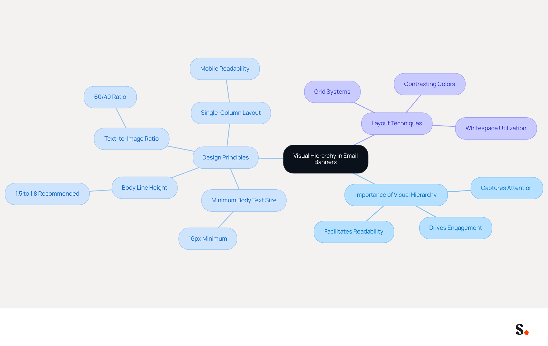
Establishing a clear visual hierarchy is crucial for creating effective email banner design that captures attention and drives engagement. This requires arranging elements by importance, using size, color, and placement to effectively direct the reader's attention. The main message should stand out as the most prominent element, typically displayed in the largest text, while secondary information can be presented in smaller, less emphasized formats. Contrasting colors help differentiate various sections, ensuring a clean and uncluttered layout. A well-organized design makes it easier to read and keeps the audience engaged.
Utilizing grid systems can uphold alignment and balance, greatly enhancing the overall visual appeal of the display. For instance, a banner featuring a bold headline as the focal point, followed by supporting text and a clear call-to-action (CTA), effectively leads the reader through the message. Current statistics indicate that messages adhering to responsive principles see a 15% increase in click-to-open rates compared to fixed-width formats, underscoring the importance of a well-executed visual hierarchy.
Key principles for effective visual hierarchy in email banner design include:
- Maintaining a minimum body text size of 16px
- Ensuring a body line height between 1.5 and 1.8 for optimal readability
- Adhering to a 60/40 text-to-image ratio to avoid spam filters
- Using a single-column layout for mobile readability, ensuring content stacks correctly across various devices
Expert insights emphasize that a clean message layout decreases cognitive load, facilitating easier engagement with the content for recipients. Alina Samulska-Kholina emphasizes that mobile-friendly design for messages ensures higher click-through rates. By prioritizing these design principles, businesses can ensure their messages resonate and achieve desired outcomes.
Integrate Branding Elements to Enhance Consistency
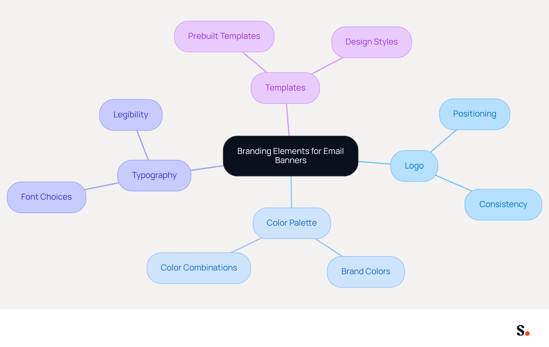
To ensure your email banner design effectively represents your brand, it is crucial to integrate key branding elements. Incorporate your logo, color palette, and typography consistently across all communications to align with your overall brand identity. For example, if your brand colors are blue and white, use these colors prominently in your design.
Position your logo strategically, typically at the top or bottom of the banner, to reinforce brand recognition. Typography should reflect your brand's voice; choose fonts that are legible and resonate with your brand's personality. A consistent look and feel not only builds your brand identity but also creates a professional image that boosts customer trust and engagement.
A study indicates that 70% of digital marketers consider consistent branding vital for effective communication with customers, underscoring the importance of these practices in marketing. By creating prebuilt templates for email banner design that incorporate these elements, you can ensure that your messages are visually appealing and memorable, ultimately driving higher engagement rates.
Furthermore, aligning your branding with corporate values and strategic objectives is crucial for reinforcing your overall message and ensuring that your marketing efforts resonate with your audience. This automation streamlines management and ensures compliance with SOC 2 Type II standards, enhancing security in your marketing efforts.
Optimize Email Banners for Mobile Responsiveness
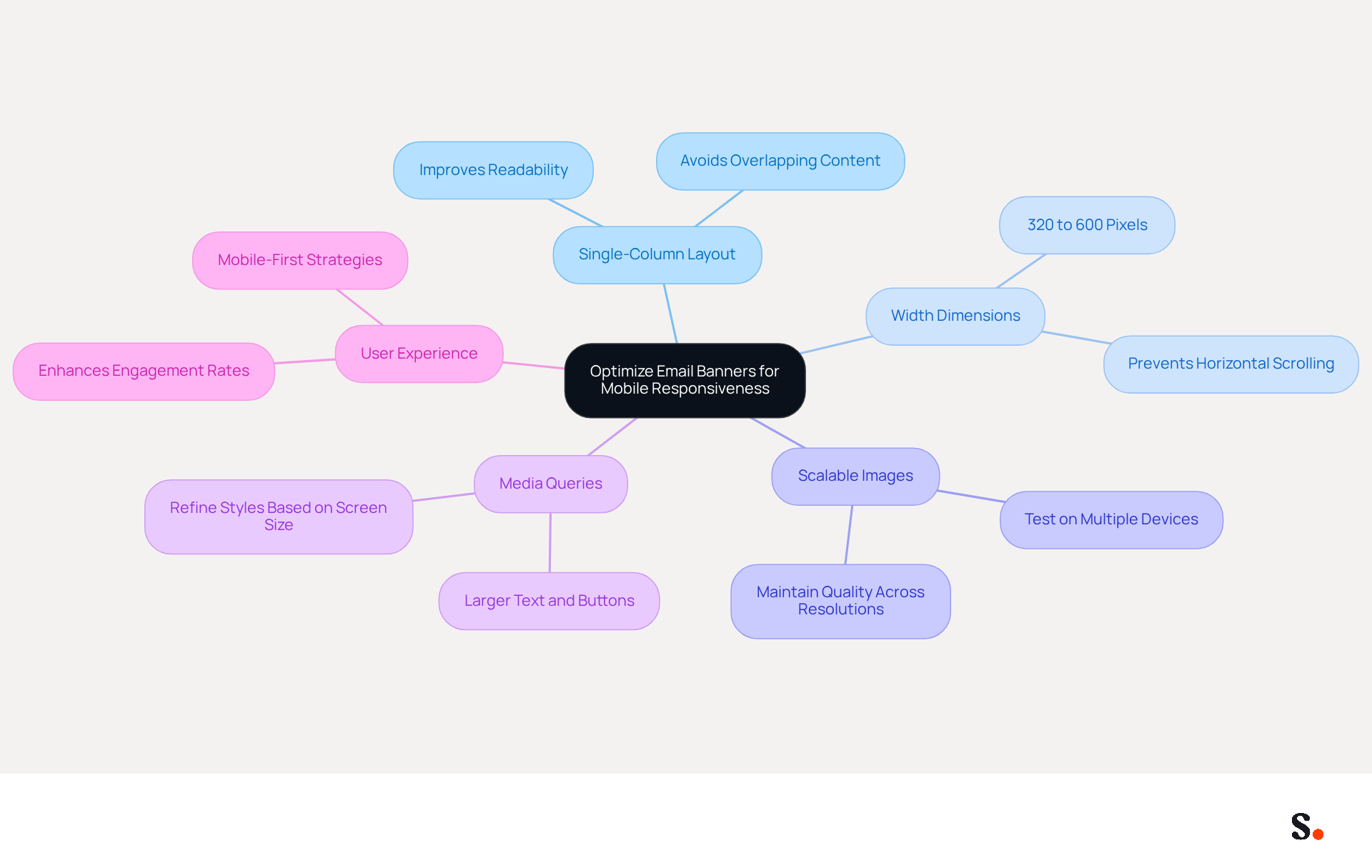
To effectively engage users, it is crucial to adopt a mobile-responsive design approach that adapts to various screen sizes. Begin with a single-column layout to improve readability on smaller devices. Maintain width dimensions between 320 and 600 pixels to ensure compatibility across most platforms. Make sure to use scalable images that look good on different resolutions, and thoroughly test your email banner design on multiple devices and messaging clients to confirm proper rendering.
Incorporating media queries in your HTML can further refine styles based on the device's screen size. For instance, larger text and buttons can significantly enhance usability on mobile devices, facilitating easier interaction with your content. Focusing on mobile responsiveness not only enhances user experience but also increases engagement rates, as over 70% of messages are accessed on smartphones. This statistic underscores the necessity of implementing mobile-first strategies, which are essential for effective marketing via messages in 2026.
Furthermore, many designers overlook critical aspects of mobile-responsive design, leading to ineffective user experiences. By applying these optimal methods and learning from successful examples like the 'Single-Column Ladder Design,' you can create effective promotional graphics, such as email banner design, that resonate with your audience and drive engagement. By prioritizing mobile responsiveness, you position your marketing efforts for success in an increasingly mobile-centric world.
Design Compelling Calls-to-Action for Increased Engagement
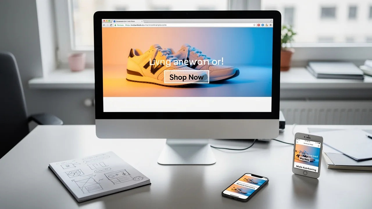
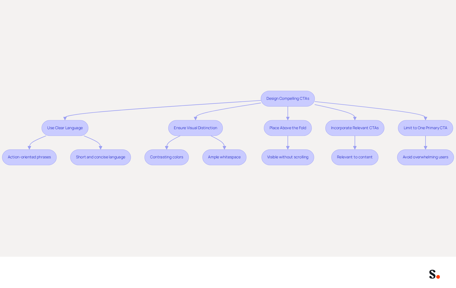
Many marketers face challenges in achieving high click-through rates due to ineffective CTAs. To create compelling CTAs in your email banner design, use clear, action-oriented language that tells users exactly what to do, such as 'Shop Now' or 'Sign Up Today.' The email banner design should ensure that the CTA button is visually distinct; employing contrasting colors and ample whitespace around the button can effectively draw attention.
Consider placing your CTAs above the fold for better visibility, ensuring they are seen without the need for scrolling. While incorporating multiple CTAs throughout the email can be beneficial, each should remain relevant to the content. For instance, if your banner highlights a sale, include a CTA that directs users to the sale page.
By applying these strategies, marketers can transform their email campaigns into powerful conversion tools, with studies indicating that effective CTA creation can lead to increased engagement. Additionally, case studies reveal that limiting the number of CTAs to one primary option can reduce overwhelm and improve user interaction, as demonstrated in various marketing campaigns.
By focusing on effective email banner design, you can drive more conversions from your email campaigns.
Conclusion
Effective email banner design is crucial for maximizing engagement and driving results in marketing communications. By focusing on:
- Visual hierarchy
- Branding consistency
- Mobile responsiveness
- Compelling calls-to-action
Businesses can create banners that not only look appealing but also achieve measurable results. Without a strategic approach, businesses risk losing potential engagement and conversions.
The article highlights the importance of establishing a clear visual hierarchy to guide the reader's attention, integrating branding elements to reinforce identity, and optimizing designs for mobile devices to enhance user experience. Additionally, research shows that businesses implementing these best practices see a 30% increase in engagement rates, highlighting their importance in today's digital marketing landscape. Crafting effective CTAs can significantly boost engagement rates, transforming email campaigns into powerful conversion tools.
Incorporating these strategies into email banner design goes beyond aesthetics. It creates a cohesive and engaging experience that truly resonates with the audience. By implementing these strategies, businesses can transform their email marketing into a powerful tool for engagement and conversion.
Frequently Asked Questions
Why is visual hierarchy important in email banner design?
Visual hierarchy is crucial because it captures attention and drives engagement by arranging elements by importance, using size, color, and placement to direct the reader's attention effectively.
How should the main message be presented in an email banner?
The main message should be the most prominent element, typically displayed in the largest text, to ensure it stands out.
What role do contrasting colors play in email banner design?
Contrasting colors help differentiate various sections of the banner, ensuring a clean and uncluttered layout that enhances readability.
What is the benefit of using grid systems in email banner design?
Utilizing grid systems helps uphold alignment and balance, greatly enhancing the overall visual appeal of the display.
What is an effective structure for an email banner?
An effective structure includes a bold headline as the focal point, followed by supporting text and a clear call-to-action (CTA), guiding the reader through the message.
How do responsive design principles impact email engagement?
Messages adhering to responsive principles see a 15% increase in click-to-open rates compared to fixed-width formats, highlighting the importance of a well-executed visual hierarchy.
What are the key principles for effective visual hierarchy in email banner design?
Key principles include maintaining a minimum body text size of 16px, ensuring a body line height between 1.5 and 1.8, adhering to a 60/40 text-to-image ratio, and using a single-column layout for mobile readability.
How does a clean message layout affect recipient engagement?
A clean message layout decreases cognitive load, facilitating easier engagement with the content for recipients.
What does Alina Samulska-Kholina emphasize about mobile-friendly design?
Alina Samulska-Kholina emphasizes that mobile-friendly design for messages ensures higher click-through rates.
List of Sources
- Establish Visual Hierarchy and Layout for Email Banners
- Email Design Best Practices for Ecommerce in 2026 (With Examples) (https://hustlermarketing.com/email-design-best-practices-for-ecommerce-in-2026-with-examples)
- Email Design Best Practices: 15 Rules for Higher Engagement (https://mailsoftly.com/blog/email-design-best-practices)
- 15 Email Design Best Practices for 2026 (https://brevo.com/blog/email-design-best-practices)
- Email design best practices: The complete guide (2026) — Stripo.email (https://stripo.email/blog/email-design-best-practices)
- 10 Email Design Best Practices for 2026 (https://reachinbox.ai/blog/email-design-best-practices)
- Integrate Branding Elements to Enhance Consistency
- Easy Steps to Maintain Brand Consistency in Email Marketing — Stripo.email (https://stripo.email/blog/easy-steps-to-maintain-brand-consistency-in-email-marketing)
- Branding statistics you need to know in 2026 (https://dash.app/blog/branding-statistics)
- Maintain brand consistency across your emails | Mailjet (https://mailjet.com/email-playbook/click-rates/brand-consistency)
- Email Branding Tips For a Consistent Customer Experience | OneSignal (https://onesignal.com/blog/email-branding-tips-to-create-a-b/amp)
- How to manage brand consistency in email marketing - Emma (https://myemma.com/blog/how-to-manage-brand-consistency-in-email-marketing)
- Optimize Email Banners for Mobile Responsiveness
- Email Design Trends and Best Practices in 2026 | Mailjet (https://mailjet.com/blog/email-best-practices/email-design-trends)
- Email Design Trends 2026: 11 Modern Newsletter Ideas | beehiiv Blog (https://beehiiv.com/blog/email-design-trends-2026?srsltid=AfmBOooujAoQCSwHMm4z8xPrr2mkw1qh1P04ycu3rBKcYWSk3vVslFoN)
- Email Design Trends for 2026 (https://designmodo.com/email-design-trends)
- Email Marketing Trends | March, 2026 (STARTUP EDITION) (https://blog.mean.ceo/email-marketing-trends-march-2026)
- Mobile Friendly Email Design Guidelines | PGM Solutions (https://porchgroupmedia.com/blog/mobile-friendly-email-design-guidelines)
- Design Compelling Calls-to-Action for Increased Engagement
- Beyond "Shop Now": how to inspire action with email CTAs - Klaviyo (https://klaviyo.com/blog/email-cta-best-practices)
- 100+ Email CTA Examples and Best Practices|100+ Email CTA Examples and Best Practices (https://brevo.com/blog/email-call-to-action-best-practices)
- 75 CTAs Your Next Email Campaign Needs (Updated) (https://campaignmonitor.com/blog/email-marketing/75-call-to-actions-to-use-in-email-marketing-campaigns)
- 65+ Best Email CTA Examples and Best Practices (2026) (https://nvecta.com/blog/email-cta-examples)
- A Strategic Guide to Calls-to-Action (CTAs) in Email Marketing: Best Practices for Success (https://litmus.com/blog/click-tap-and-touch-a-guide-to-cta-best-practices)
Get started with Scribe
Build a professional email signature
Free 14-day trial — no credit card.