Choose the Best Email Signature Font for Brand Consistency
Choosing the right font for email signatures can be a daunting task, yet it is crucial for maintaining brand consistency and effective communication. This
Sophie Grant
Email Signature Specialist, Scribe
On this page
Introduction
Choosing the right font for email signatures can be a daunting task, yet it is crucial for maintaining brand consistency and effective communication. This guide will explore key characteristics of effective email signature fonts, providing insights to enhance readability and align with your brand identity. With so many fonts to choose from, organizations often struggle to find the right fit for their brand while ensuring clarity across various platforms.
Identify Key Characteristics of Effective Email Signature Fonts
Selecting the best email signature font is crucial for effective communication and brand representation. When choosing a typeface, consider the following key characteristics:
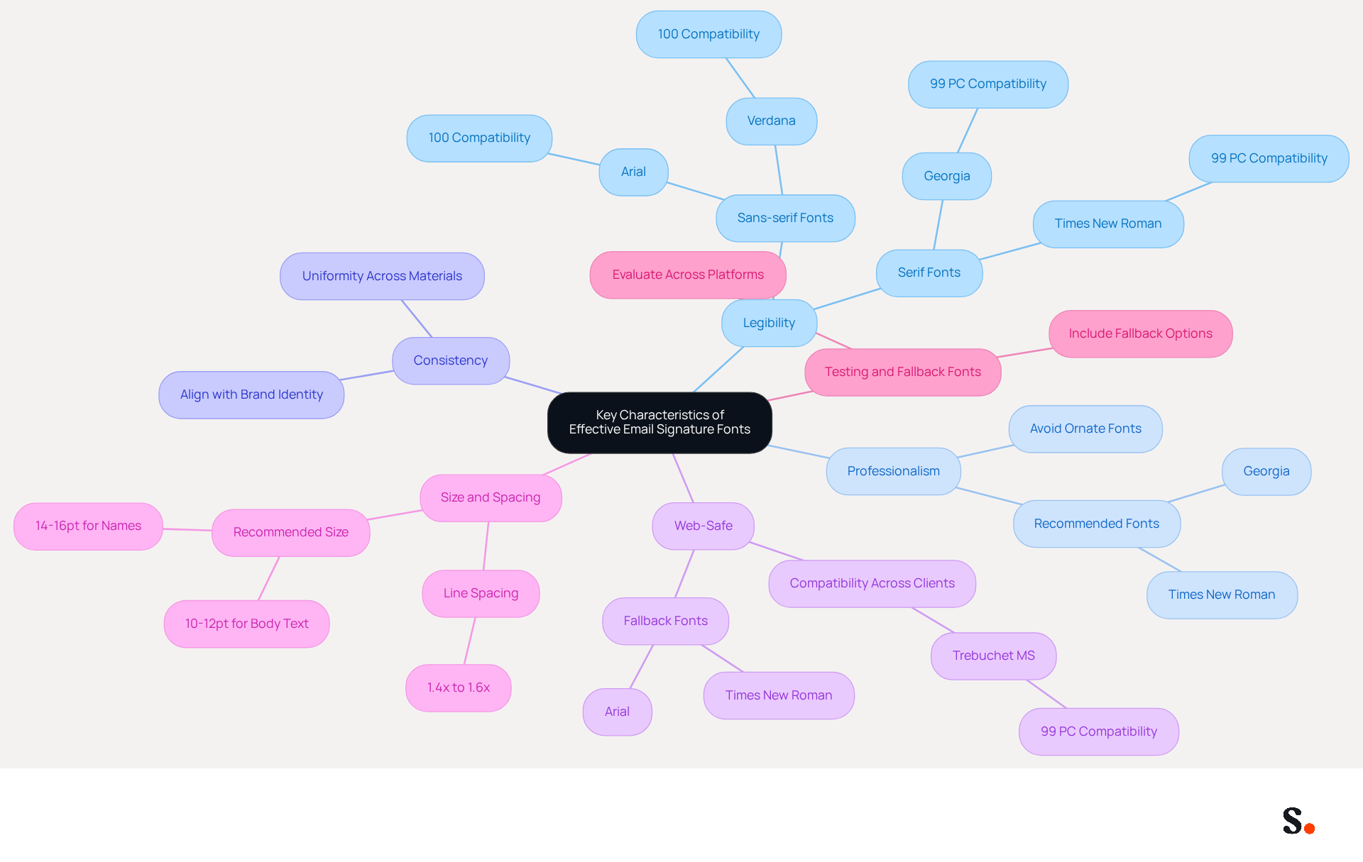
- Legibility: The typeface must be easy to read at various sizes. Sans-serif typefaces such as Arial and Helvetica are frequently favored for their clarity, particularly on smaller displays. Studies show that the best email signature font is typically a sans-serif font, which is easier to read.
- Professionalism: It's essential to select the best email signature font that effectively projects professionalism. Avoid excessively ornate or informal typefaces, as they can diminish your organization's credibility. For instance, Times New Roman and Georgia are recommended for their formal appearance, with Georgia boasting a compatibility rate of 99% on PC and 97% on Mac. Maintaining a clean appearance with typefaces like Arial, which has 100% compatibility on both PC and Mac, can enhance trustworthiness.
- Consistency: The selected typeface should align with your overall identity and be uniform with other marketing materials. Using the best email signature font consistently strengthens brand identity, ensuring that your correspondence reflects your company's image effectively.
- Web-Safe: Choose universally supported web-safe typefaces that are compatible across various messaging clients and devices. This ensures your mark appears as intended, regardless of the recipient's email platform. Fonts like Verdana and Trebuchet MS are known for their compatibility, with Verdana offering 100% compatibility on both PC and Mac.
- Size and Spacing: Maintain a font size between 10-12 points for optimal readability, with recommended sizes of 14-16 points for names to create visual hierarchy. Proper line spacing (1.4x to 1.6x) and letter spacing (1px to 2px) are crucial to prevent clutter and improve the overall look of your mark.
- Testing and Fallback Fonts: It is essential to evaluate your correspondence across various platforms to ensure compatibility. Including fallback typefaces, such as Arial or Times New Roman, is crucial to uphold professionalism and avoid messy or unexpected type changes if the preferred style is unavailable.
Ultimately, using the best email signature font can significantly enhance your professional image and ensure your messages are received as intended.
Evaluate Readability and Compatibility of Selected Fonts
To maintain a professional email signature, it is crucial to evaluate its readability and compatibility across various platforms:
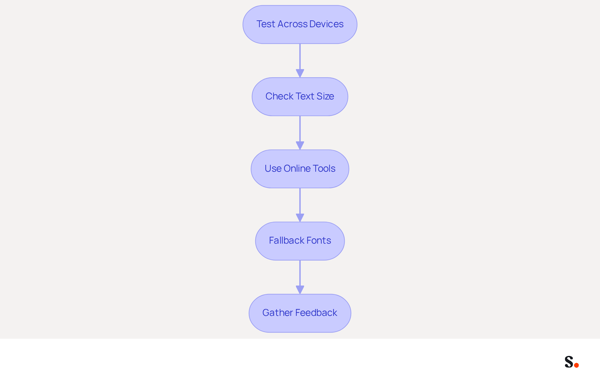
- Test Across Devices: Send test messages to various devices (desktop, tablet, mobile) and clients (Gmail, Outlook, Apple Mail) to assess the typeface's appearance. Incompatibility issues can arise when digital identifiers are created on one operating system and viewed on another.
- Check Text Size: Ensure the text size is legible on all devices. A size of 10-12 points is generally recommended for body text, while 14-16 points is ideal for names to create a visual hierarchy.
- Use Online Tools: Utilize tools like Litmus or Email on Acid to preview how your email signature appears across different platforms. These tools help identify rendering inconsistencies that could affect professionalism.
- Fallback Fonts: Always include fallback options in your HTML code. For instance, if you select a custom typeface, specify a web-safe alternative (e.g., Arial) to ensure readability if the primary typeface fails to load. This practice helps maintain brand consistency and prevents confusion if the recipient does not have the custom font installed.
- Gather Feedback: Consider asking colleagues or clients for their thoughts on how clear your contact information is to identify any potential issues. Regular evaluations, preferably quarterly, can assist in identifying mistakes and ensuring that the endorsement remains effective.
By thoroughly assessing readability and compatibility, you can ensure that your contact information maintains its professional appearance regardless of where it is viewed. Additionally, syncing your Google Workspace with Scribe streamlines this process by allowing automatic updates of your teammates' information. This means any changes, such as job positions or group assignments, are reflected in your email signatures without manual input, enhancing engagement and ensuring brand consistency.
Implement Web-Safe Fonts and Fallback Options for Consistency
To ensure effective email communication, it is essential to implement web-safe fonts and fallback options:
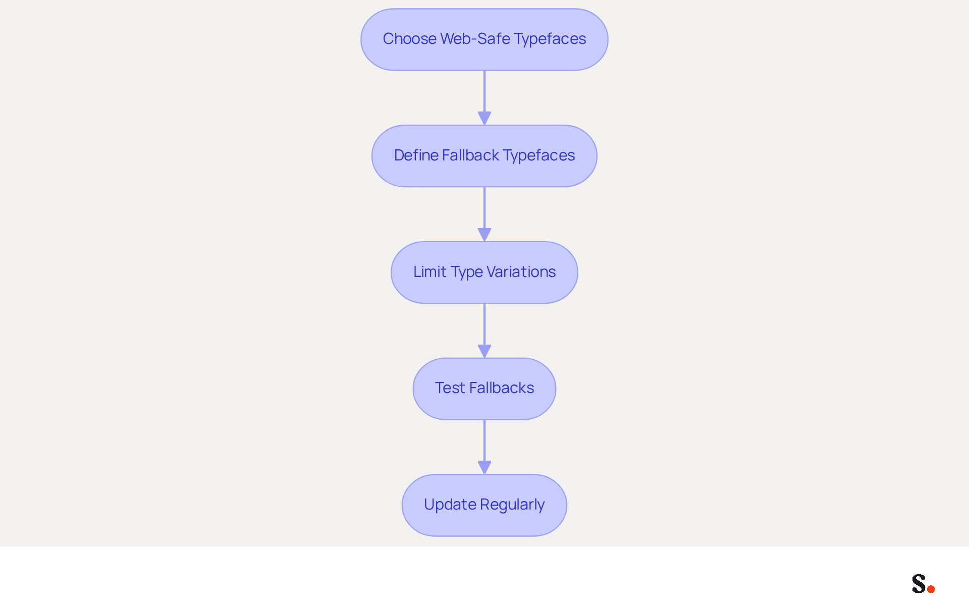
- Choose Web-Safe Typefaces: Opt for widely recognized and supported styles such as Arial, Verdana, or Georgia. These typefaces help avoid display problems across various messaging clients, as there are 13 web-safe typefaces guaranteed to display correctly.
- Define Fallback Typefaces: In your Scribe's HTML, specify fallback typefaces in the following order:
font-family: 'YourChosenFont', Arial, sans-serif;. This ensures that if the primary typeface is unavailable, the email client defaults to Arial or another sans-serif type, maintaining readability and professionalism. - Limit Type Variations: Stick to one or two styles in your email to uphold a clean and professional appearance. Overusing various typefaces can lead to visual clutter, which detracts from your brand image.
- Test Fallbacks: After configuring your signature, send test messages to yourself to confirm how the fallback styles appear in case the primary style fails. This step is crucial for ensuring consistency across devices.
- Update Regularly: As messaging clients and devices advance, periodically review and refresh your typeface selections and fallback options to ensure ongoing compatibility and professionalism. Be aware of the potential risks associated with using custom typefaces, which may not display correctly on all devices.
By adhering to these guidelines, you safeguard your brand's professionalism and ensure consistent communication across all platforms.
Align Font Choices with Brand Identity and Consistency
Choosing the best email signature font that aligns with your brand identity is crucial for maintaining a consistent and professional image in your email signatures.
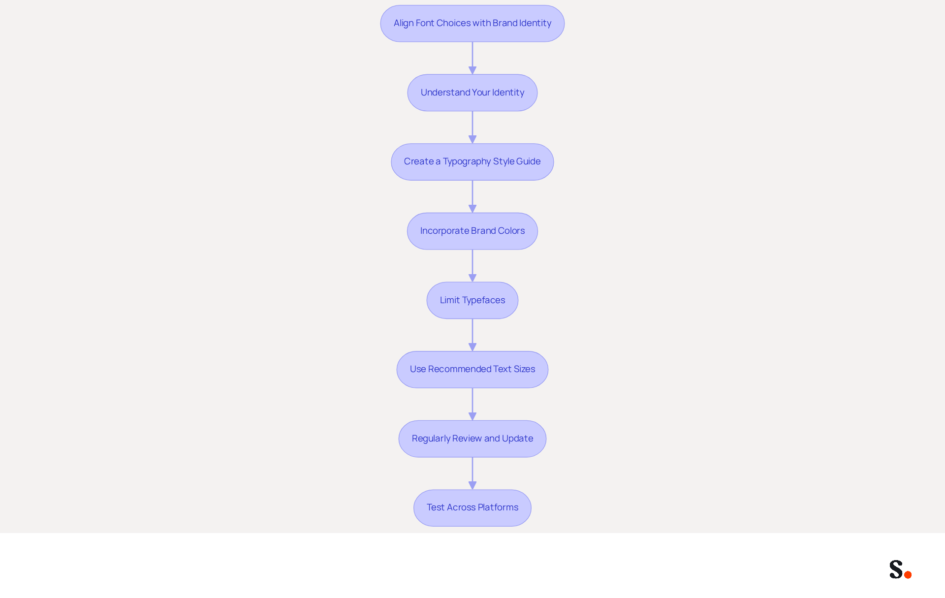
- Understand Your Identity: Identify the characteristics of your identity (e.g., modern, traditional, playful) and choose typefaces that reflect these traits. For instance, a tech company might opt for sleek sans-serif styles, while a law firm may prefer classic serif types like Georgia for their readability. This alignment boosts recognition and builds a professional image, which can drive greater engagement.
- Create a Typography Style Guide: Develop a style guide that outlines the typefaces to be used across all marketing materials, including signature lines. This ensures consistency in all communications and reinforces identity, which is crucial for maximizing the impact of your email outreach when you choose the best email signature font.
- Incorporate Brand Colors: Use your brand colors alongside your selected typefaces to create a cohesive look. Ensure that the text color contrasts well with the background for readability, adhering to accessibility standards. High-contrast colors enhance legibility for all users, making your emails more effective in generating leads.
- Limit Typefaces: Stick to a maximum of two typefaces to maintain a unified appearance. This helps avoid visual confusion and reinforces brand identity. Furthermore, using the best email signature font ensures uniform rendering across devices, which is crucial for maintaining a professional image.
- Use Recommended Text Sizes: For names, use a size between 14-16pt, and for contact details, stick to 10-12pt. This sizing guarantees readability, particularly on mobile devices, where numerous users access their messages.
- Regularly Review and Update: As your identity evolves, revisit your typeface selections to ensure they still align with your current image and messaging. Neglecting to update your typography can result in a disjointed brand image that confuses your audience. Regular updates reflect changes in branding and maintain relevance in communications, which can help attract new clients.
- Test Across Platforms: Before finalizing your correspondence identifiers, test them across various messaging clients to ensure they display correctly. Not testing across platforms can result in miscommunication and damage your professional image.
By ensuring consistency in your email signatures, you not only enhance your brand's professionalism but also improve your overall marketing effectiveness. With Scribe's automated management of digital signatures, you can ensure that these elements are consistently applied across your team, driving consistency and lead generation effortlessly. Additionally, Scribe's compliance with SOC 2 Type II, GDPR, and CCPA ensures that your email signature management is secure and trustworthy, further enhancing your brand's credibility.
Conclusion
Selecting the right email signature font is crucial for ensuring effective communication and brand representation. A carefully selected typeface is essential for enhancing readability and reinforcing an organization's identity, making certain that each email embodies the organization's core values and professional image.
Key characteristics of effective email signature fonts include legibility, professionalism, and compatibility across various platforms. By opting for web-safe fonts and implementing fallback options, organizations can avoid display issues and maintain a cohesive appearance. It's important to regularly test and update font choices to keep them aligned with the brand identity and remain effective across different devices and email clients.
Ultimately, the choice of email signature font plays a significant role in shaping perceptions and driving engagement. By prioritizing font consistency and aligning it with brand identity, organizations can significantly enhance their professional image and foster stronger connections with their audience. Leveraging tools like Scribe not only simplifies the management of email signatures but also ensures compliance with security standards, allowing teams to focus on what truly matters-building strong connections with their audience.
Frequently Asked Questions
Why is selecting the best email signature font important?
Selecting the best email signature font is crucial for effective communication and brand representation, as it impacts legibility, professionalism, and overall image.
What characteristics should I consider when choosing an email signature font?
Key characteristics to consider include legibility, professionalism, consistency, web-safe compatibility, size and spacing, and the use of fallback fonts.
Which typefaces are recommended for legibility in email signatures?
Sans-serif typefaces such as Arial and Helvetica are favored for their clarity, especially on smaller displays.
How does professionalism influence the choice of email signature font?
The font should project professionalism; ornate or informal typefaces can diminish credibility. Recommended fonts for a formal appearance include Times New Roman and Georgia.
What is the compatibility rate of Georgia and Arial on different operating systems?
Georgia has a compatibility rate of 99% on PC and 97% on Mac, while Arial boasts 100% compatibility on both platforms.
Why is consistency important in email signature fonts?
Consistency strengthens brand identity and ensures that your correspondence reflects your company's image effectively.
What are web-safe typefaces, and why are they important?
Web-safe typefaces are universally supported fonts that ensure compatibility across various messaging clients and devices, allowing your email signature to appear as intended.
Which fonts are known for their web-safe compatibility?
Fonts like Verdana and Trebuchet MS are known for their compatibility, with Verdana offering 100% compatibility on both PC and Mac.
What font size is recommended for optimal readability in email signatures?
A font size between 10-12 points is recommended for readability, with sizes of 14-16 points suggested for names to create visual hierarchy.
How can I ensure my email signature maintains professionalism across different platforms?
It is essential to test your correspondence across various platforms and include fallback typefaces, such as Arial or Times New Roman, to avoid unexpected type changes.
List of Sources
- Identify Key Characteristics of Effective Email Signature Fonts
- How to Choose Best Email Signature Fonts for Professionalism - NEWOLDSTAMP (https://newoldstamp.com/blog/how-to-choose-the-best-email-signature-fonts-to-make-your-email-look-professional)
- Professional Fonts for Email: Choosing a Font for Business Emails | iContact (https://icontact.com/blog/blog-professional-fonts-for-email)
- The Best Fonts for Email Signatures: A Professional Guide (https://linkedin.com/pulse/best-fonts-email-signatures-professional-guide-bulksignature-tmvuf)
- Best fonts for Email Signatures: 7 Email-Safe Options (https://wisestamp.com/guides/what-are-the-best-fonts-for-email-signatures)
- Evaluate Readability and Compatibility of Selected Fonts
- How to Choose Best Email Signature Fonts for Professionalism - NEWOLDSTAMP (https://newoldstamp.com/blog/how-to-choose-the-best-email-signature-fonts-to-make-your-email-look-professional)
- The Best Fonts for Email Signatures: A Professional Guide (https://linkedin.com/pulse/best-fonts-email-signatures-professional-guide-bulksignature-tmvuf)
- The Best Fonts for Email Signatures That Look Clean and Professional (https://bulksignature.com/blog/the-best-fonts-for-email-signatures)
- Email Signature Best Practices for 2026 (+ 15 Pro Examples) (https://wavecnct.com/blogs/email-signature-best-practices-2026)
- Implement Web-Safe Fonts and Fallback Options for Consistency
- How to Choose Best Email Signature Fonts for Professionalism - NEWOLDSTAMP (https://newoldstamp.com/blog/how-to-choose-the-best-email-signature-fonts-to-make-your-email-look-professional)
- Constant Contact Knowledge Base (https://knowledgebase.constantcontact.com/email-digital-marketing/articles/KnowledgeBase/5877-Email-safe-and-web-safe-font-selections-in-emails?lang=en_US)
- Email Signature Design - Best Practices and Examples - Gimmio (https://blog.gimm.io/email-signature-design)
- Best fonts for email signatures (Outlook, Mac) (https://support.xink.io/support/solutions/articles/1000047729-which-fonts-should-i-use-in-email-signatures-)
- The Ultimate Guide to Web Safe Fonts for Email Marketing (https://litmus.com/blog/the-ultimate-guide-to-web-fonts)
- Align Font Choices with Brand Identity and Consistency
- The Best Fonts for Email Signatures: A Professional Guide (https://linkedin.com/pulse/best-fonts-email-signatures-professional-guide-bulksignature-tmvuf)
- Email Marketing Typography Guide for 2026 | Dyspatch (https://dyspatch.io/blog/email-marketing-typography-guide-for-2026)
- Typography and colors for email signatures: How to choose them well? (https://signitic.com/en/resources/typography-and-colors-for-email-signatures)
- 4 Best Practices for a Personal Email Signature That Boosts Branding (https://scribe-mail.com/en-US/blog/4-best-practices-for-a-personal-email-signature-that-boosts-branding)
Get started with Scribe
Manage signatures across your whole team
Free 14-day trial — no credit card.