Email Signature Block Templates: How to Choose and Customize the Right Pattern
Choose an email signature block template by role, essential details, brand elements, readability, and how often your team updates it.
Sophie Grant
Email Signature Specialist, Scribe

On this page
- Choose a template for the sender’s context
- Separate the template from the finished signature
- Start with the basic professional pattern
- Match the pattern to the professional context
- Separate essential details from optional additions
- Use brand elements without overwhelming the block
- Keep the layout readable across devices
- Remove elements that create clutter
- Choose between a plain-text, HTML, or generator-based starting point
- Treat team-branded templates as a maintenance decision
- Use update frequency to assess a managed approach
- Apply the selection test before adopting the template
- When should a team reassess an email signature template?
- What is the difference between an email signature block template and an email signature generator?
- Should a company use one email signature template for every employee?
- What should I check before downloading or customizing a free email signature template?
- When does an email signature template need a managed team process?
- Sources
Choose a template for the sender’s context
Choosing an email signature block starts with the sender’s purpose, not with a decorative layout. A template gives you a repeatable structure for the information and visual elements that may appear beneath your messages; a finished signature fills that structure with your name, role, company, contact details, and any selected brand treatment.
The useful question is not which design looks most elaborate. It is which pattern fits the way you communicate and the way the signature will be maintained. An individual who sends occasional professional messages may need a simple structure that can be adapted once. A team that changes roles, campaigns, or brand elements needs a pattern that remains clear when several people use it and when the content changes.
Use this selection test as you compare starting points:
- Match the structure to your professional purpose and role.
- Put identity and contact information before optional visual or promotional additions.
- Choose a restrained layout that remains readable across devices.
- Decide whether you will update the signature occasionally or maintain several related versions over time.
This approach keeps customization practical. You can begin with a basic pattern, add only the elements that serve your work, and reserve a managed approach for a team whose maintenance needs justify it.
A template is useful when it reduces repeat decisions without forcing every sender into identical content. Keep the structure shared where consistency matters, but leave room for role-specific information and relevant actions. That distinction lets you judge a template by its purpose and upkeep rather than by appearance alone.
Separate the template from the finished signature
An email signature template is a starting structure, while a finished email signature is the completed version you use in messages. The template can show where the sender’s name, role, company, contact information, logo, and other selected elements belong without committing you to one person’s details or one final design.
That distinction gives you room to adapt the same pattern to a particular role. You might retain the same order and visual treatment while changing the name, job title, contact information, or a relevant call to action. A basic email signature may include your full name, job title, company, and contact information. Those fields establish the identity of the sender before you decide whether anything else earns space.
A finished signature therefore answers more questions than a template does:
- Whose messages will carry it?
- What professional context does that person represent?
- Which contact details help the recipient respond?
- Which brand or action elements are relevant to the message?
- How will the content be changed when the role or campaign changes?
Treat the template as a decision framework rather than a promise that every field belongs in every version. Start with the structure, fill in the necessary information, and remove any element that does not help the recipient understand or act on the message.
Keep the distinction visible while customizing. A template can contain labels, placeholders, or alternate arrangements for evaluation; a finished signature contains the approved information for one sender or role. Review the completed version on its own, because a structure that looks balanced with placeholder text can become crowded when real names, titles, and contact details are inserted.
Start with the basic professional pattern
A basic professional email signature pattern begins with your full name, job title, company, and contact information. This is a practical starting point for company email because it answers the recipient’s first questions: who sent the message, what role that person holds, which organization they represent, and how to continue the conversation.
Build the first version in that order before adding design treatment. The order is less significant than the clarity of the grouping, but the identity details should remain easy to find. If your name and role are visually separated from your contact information, use spacing or a restrained divider rather than several competing styles.
You can turn the basic pattern into a working draft with a short inventory:
- Write the sender’s full name exactly as it should appear in professional correspondence.
- Add the sender’s job title and company.
- Add the contact information that supports the sender’s normal work.
- Leave space for any brand or action element you may evaluate later.
- Read the block without its colors or logo and check whether the sender remains identifiable.
This pattern is deliberately limited. It gives you a complete identity layer without assuming that every professional role needs a logo, booking action, social link, quote, or additional visual treatment. Once the plain structure works, you can assess each addition against the sender’s context and the recipient’s likely needs.
Use the basic pattern as the control version for later comparisons. If a logo, color, or call to action makes the block harder to understand than the plain version, the addition has not improved the template for that context. Keeping this simple version also gives you a clear fallback when optional elements are not relevant.

Match the pattern to the professional context
A professional context determines which parts of the basic pattern deserve emphasis. The same identity fields can support different working relationships, but the surrounding treatment should reflect the sender’s role rather than forcing every signature into one design.
Use these patterns as starting points, not fixed requirements:
- Basic professional pattern: Use the name, job title, company, and contact information as the primary block when the signature mainly identifies the sender.
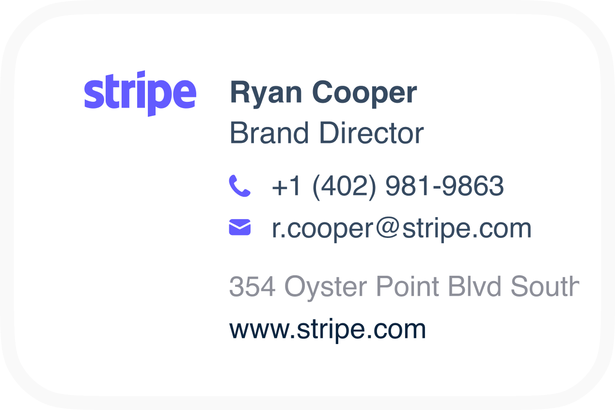
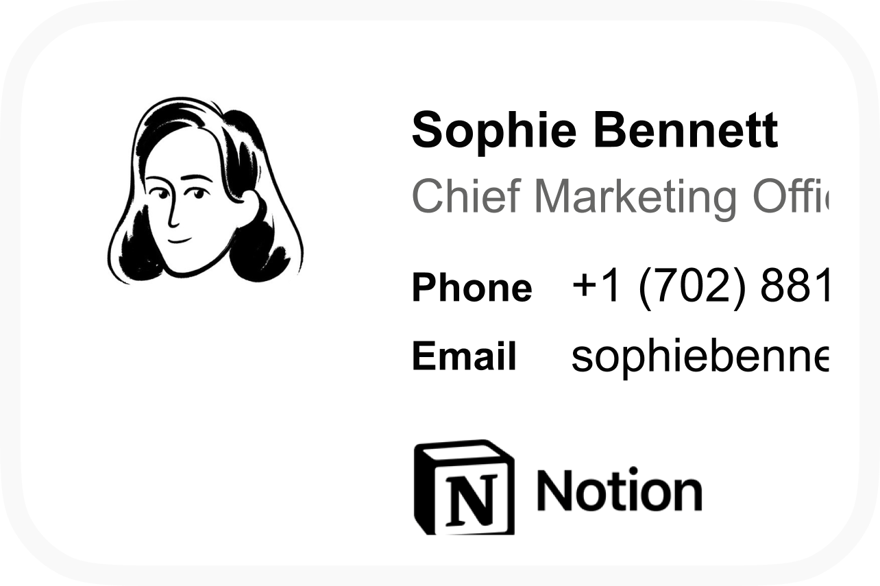
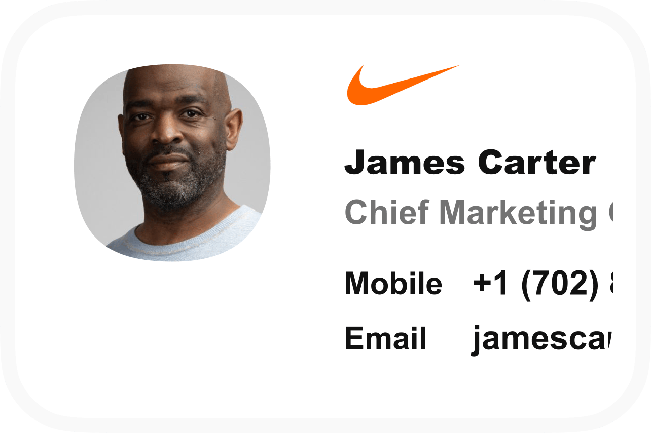
- Executive or founder pattern: Keep the identity layer prominent and add brand treatment only when it supports the sender’s public-facing role. Role-specific template categories included options for C-suite leaders and founders.
- Client-facing pattern: Preserve a clear route to contact and consider one relevant action, such as a booking call to action, if that action belongs to the sender’s work. The action should not compete with the identity details.
- Team-branded pattern: Use a shared structure when several people need a consistent visual presentation, then allow the individual fields to change by sender.
- Specialist pattern: Start with the professional identity and contact structure, then assess whether the role calls for a distinct treatment. Professional template categories included physicians, nursing professionals, attorneys, realtors, educators and faculty, and photographers.
An effective email signature balances essential contact details, company logos, and clear booking calls to action without cluttering mobile screens. That balance matters more than the label attached to the pattern. Choose the smallest structure that represents the sender’s purpose, then test whether the optional elements still leave the identity and contact path obvious.
Match the pattern to the communication task, not to a job title alone. An executive who mainly needs identification may use the basic pattern, while a client-facing sender may need a relevant booking action. The role helps you form a hypothesis; the actual purpose of the email determines which additions remain useful.
When you adapt a role-specific pattern, keep the supported structure narrow. Do not assume that a category designed for one profession automatically requires extra fields or a different visual treatment. Begin with the common identity layer, then add only what the sender can explain in terms of the work being done.
Separate essential details from optional additions
Essential details identify the sender and give the recipient a useful way to continue the conversation. Optional additions shape presentation or invite an action, but they should earn their place after the identity layer is complete.
Start with the fields a basic professional signature may include: your full name, job title, company, and contact information. Keep those details together as the stable part of the template. They should remain understandable if you remove the logo, color treatment, or call to action.
Then review optional additions one at a time:
- Logo: Consider whether the company mark helps establish the organization without taking attention from the sender.
- Brand color: Use it as a restrained visual cue rather than as the main source of contrast.
- Booking call to action: Include one when scheduling is relevant to the sender’s work and the action has a clear purpose.
- Other links: Include a link only when it is relevant to the sender’s role and useful in the context of the email.
This order prevents optional content from becoming a substitute for clear identification. It also makes adaptation easier: you can keep the same core structure for several roles while changing or removing additions that do not apply. When the signature feels crowded, remove optional elements before shrinking the essential text or making the layout harder to scan.
A simple approval rule helps when several people edit the same pattern: approve the identity layer first, then evaluate each optional element against purpose, relevance, and space. If an addition cannot pass all three tests, leave it out. The result may contain fewer elements, but each remaining element has a clearer job.
Use brand elements without overwhelming the block
Brand elements should support recognition while leaving the sender’s identity easy to find. A company logo, a restrained color treatment, or a relevant call to action can give a shared template a consistent presentation, but each addition changes the space and attention available to the core contact details.
Consistent email signatures can support visual identity across sales teams and contribute to credibility in sent emails. That does not mean every signature needs the same number of elements. It means a shared pattern should make the organization recognizable without making each message feel like a display advertisement.
Use a simple review for every brand element:
- Does it identify or support the company in this professional context?
- Can you still find the sender’s name, role, and contact information quickly?
- Does the element have a clear job, such as directing the recipient to a relevant booking action?
- Does it remain proportionate when the signature is viewed on a smaller screen?
You can include a small company logo in JPG or PNG format; keep images under 10KB to support quick loading and avoid spam filters. That technical limit is a practical condition for the logo, not a reason to add several images. Keep the visual hierarchy modest: identity first, contact path second, and brand or action elements only where they contribute something specific.
Treat the logo, color treatment, and call to action as separate choices rather than one branding package. A logo may identify the company, while a booking action may support a particular work pattern. Keeping those jobs separate makes it easier to remove one element without weakening the rest of the signature.
Keep the layout readable across devices
A readable signature layout gives the same basic information a clear path whether the message is opened on a larger screen or a smaller device. The layout should make the sender’s identity, role, company, and contact information easy to scan without relying on dense decoration or a complicated arrangement.
For an accessible email design, choose a simple, flexible template; one- or two-column layouts are preferred because they are easier to read on multiple devices. A simple layout also gives you a cleaner foundation for adapting the pattern across roles. If a second column adds a logo or action, check that the primary identity information still reads in a sensible order.
Review the layout in stages:
- Read the text without looking at color or images.
- Check whether the columns preserve a clear order when the available width becomes smaller.
- Look for long lines, tightly packed fields, or visual gaps that separate related information.
- Check whether the logo or action draws more attention than the sender’s name.
- Remove an element that makes the structure harder to follow.
Use images and design elements carefully, and avoid distracting animations or chaotic designs. A template does not need to display every brand asset to look considered. A clear structure, limited visual complexity, and a readable information order give you a more dependable starting point for professional email.
Run the review with the real content, not only with placeholder text. Long names, job titles, or contact details can change the balance of a block. If the layout becomes difficult to scan after those details are inserted, simplify the structure instead of compensating with smaller text or more decoration.
Remove elements that create clutter
Clutter appears when the signature asks the recipient to process too many visual treatments, messages, or unrelated links at once. Removing content is often more useful than adding another style rule, especially when the essential identity and contact information already fit the sender’s purpose.
Avoid large images, multiple fonts, bright colors, unnecessary disclaimers, promotional language, lengthy quotes, and personal social media links unless they are relevant to your role. Each item can distract from the sender’s identity or make the block feel less connected to the message.
Use a deletion pass after you have drafted the signature:
- Remove any image that does not identify the company or support the sender’s work.
- Reduce the number of fonts and colors until the text has a clear hierarchy.
- Delete a quote that does not help the recipient understand the sender or the message.
- Remove a personal social link when it has no role-related purpose.
- Question any promotional sentence that makes the signature read like a separate advertisement.
Keep the review tied to context. A link or action can be relevant in one role and unnecessary in another. If you cannot explain what an element contributes to the sender’s professional communication, leave it out of the template.
Do the deletion pass after checking the identity layer, because removing a useful contact detail would solve the wrong problem. The aim is a shorter path to the necessary information, not a block with the fewest possible characters.
Choose between a plain-text, HTML, or generator-based starting point
The format you choose affects how much visual structure you can apply before using the signature. You can use plain text or HTML for an email signature. Plain text gives you a direct, low-complexity starting point; HTML gives you more room for structured spacing, links, and restrained brand elements.
As of November 5, 2026, HubSpot’s browser-based Email Signature Generator creates HTML-formatted signatures for Gmail, Outlook, Apple Mail, and more in under 5 minutes, with no account required. Its page also lists 12 professional email signature templates that you can customize with brand colors and a logo before copying the signature into a platform.
Choose the starting point by the work you need to do:
- Plain text: Use it when the identity and contact layer is the priority and visual treatment is unnecessary.
- HTML: Use it when you need a structured signature with links or limited brand presentation.
- Generator-based draft: Use it when a prebuilt layout helps you compare patterns and adapt brand elements more quickly.
A generator’s speed does not decide whether the resulting pattern fits your context. Review the generated block using the same tests: identity first, relevant additions only, readable structure, and an update process you can maintain. Copying a design is the start of customization, not the end of selection.
Choose the format that matches your ability to maintain the result. A generator can help you begin with a layout, but you still need to inspect the actual information, visual balance, and relevance of its optional elements. Plain text can be enough when the main requirement is clear identification; HTML or a generated draft can be useful when structured brand presentation has a defined purpose.

Treat team-branded templates as a maintenance decision
A team-branded template is more than an individual design choice because several people may rely on the same structure. The template needs a stable identity layer, a clear place for sender-specific details, and a practical way to handle changes without turning every update into a separate redesign.
For a shared pattern, define what should remain consistent: the basic order of information, the restrained visual treatment, and any approved brand element that belongs across the team. Keep sender-specific details flexible where roles or contact information differ.
Before adopting a shared pattern, write down the maintenance questions:
- Which parts should remain the same across the team?
- Which fields change from one sender to another?
- Which optional elements belong only to certain roles or conversations?
- How will you recognize that the template needs an update?
- Who will decide whether a changed element still fits the original purpose?
We allow marketing and IT teams to create email signatures that match their company’s visual appearance. That establishes a possible route for teams that want marketing and IT to work from a shared brand direction. It does not remove the need to define the team’s information structure and update expectations first. Make those decisions before treating a team pattern as finished.
Separate stable decisions from changing decisions. The visual treatment and information order may remain shared, while names, roles, contact information, and selected actions may vary. This separation gives you a clearer maintenance boundary: update the shared pattern when the brand direction changes, and update individual fields when a sender’s circumstances change.
Use update frequency to assess a managed approach
Update frequency helps you decide whether an individual template remains practical or whether your team should assess a managed email signature approach. A single person making an occasional change can usually review the pattern, adapt the relevant fields, and apply the updated version. Several people using related signatures create a different maintenance question, especially when roles, brand elements, or calls to action change at different times.
Use this decision path:
- Occasional individual changes: Adapt a plain-text, HTML, or generator-based starting point when one sender owns the content and changes are infrequent.
- Several related signatures: Define the shared structure and the fields that vary by role before deciding how updates should be handled.
- Frequent team changes: Assess whether a managed approach would give the team a more suitable way to keep the visual treatment aligned as the content changes.
We help marketing teams design email signatures aligned with their brand. We also describe our email signatures as designed to align with your company’s visual identity.
Make the assessment concrete by listing the number of patterns you expect to maintain, the parts that change, and the people involved in reviewing those changes. If the list is short and stable, an adapted template may be enough. If the list keeps growing, compare the maintenance burden with the value of a shared process before you commit to a format.
The decision is about upkeep, not about replacing the template itself. You can still use the same selection test for a managed approach: confirm the professional purpose, preserve the identity layer, limit optional elements, and keep the layout readable. The additional question is whether the team can keep those decisions aligned as the signatures change.
Apply the selection test before adopting the template
Selecting an email signature template is a final check against purpose, information, presentation, readability, and maintenance. Use the following sequence before you adopt a pattern:
- Confirm the context. Decide whether the signature represents one professional sender, a client-facing role, or a shared team identity.
- Complete the identity layer. Add the sender’s full name, job title, company, and contact information. A basic email signature may include those fields.
- Review each addition. Keep a logo, brand color, or booking call to action only when it serves the sender’s role and does not crowd the identity details.
- Check the layout. Choose a simple, flexible structure; one- or two-column layouts are preferred because they are easier to read on multiple devices.
- Remove distractions. Delete excessive imagery, fonts, colors, quotes, unrelated links, and other content that weakens the professional purpose.
- Set the maintenance boundary. Decide whether one person will make occasional changes or whether several related signatures need a process for staying aligned.
Use that balance as the acceptance test rather than treating visual complexity as a sign of quality. For an individual legal, compliance, or accessibility decision, consult a qualified professional.
If your team needs a shared brand direction and a way for Marketing and IT to work from the same signature structure, we allow marketing and IT teams to create email signatures that match your company’s visual appearance.
When should a team reassess an email signature template?
What is the difference between an email signature block template and an email signature generator?
A template is the structure for arranging identity, contact, brand, and optional action elements. A generator is a tool that helps turn that structure into a formatted signature, often by letting you customize a prebuilt layout. The generated result still needs review with real sender details, relevant branding, readability, and maintenance in mind.
Should a company use one email signature template for every employee?
Use one shared structure when consistency matters, but do not assume every sender needs identical content. Keep the information order and approved brand treatment consistent while allowing names, roles, contact details, and role-specific actions to vary. Review optional elements separately for each professional context.
What should I check before downloading or customizing a free email signature template?
Check whether the pattern supports the sender’s purpose, includes space for the necessary identity and contact details, and remains readable with real content. Review its fonts, colors, images, links, and calls to action for relevance and restraint. Also confirm that the resulting format and layout are practical to maintain after customization.
When does an email signature template need a managed team process?
A managed process becomes worth assessing when several related signatures must stay aligned or when roles, brand elements, and calls to action change frequently. List which parts are shared, which fields vary, who reviews changes, and how often updates occur. If the pattern is limited to one sender and occasional edits, an adapted individual template may be sufficient.
Get started with Scribe
Build a professional email signature
Free 14-day trial — no credit card.